20 Great (and 20 not so great) Logo Redesigns
Logos express complex ideas and concepts with simplified illustrations and typefaces that communicate distinctively and effectively. They are one of the most difficult aspects of graphic design for this reason. Some logos are incredibly clever and effective while others are poorly made and fail to communicate.
Lets start with the great:
Jack in the box
The new logo for Jack In The Box is modern, fun, and quirky – just like their mascot (Jack). The brand extensions for the different types of sandwichesthey offer are also fun. The only thing off about the new logo is the “in the box” text that just seems to be placed under the image as an afterthought. This project was designed by Duffy & partners.
Pyramid Beer
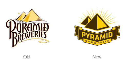
The redesign of the Pyramid Breweries Logo is simple and distinctive. The new logo places more emphasis on the geometric pyramid symbol. The type in the new logo is also much easier to read. The new simplified logo communicates boldness and distinctiveness. The new logo is also accompanied by several new and bold label designs.
Kentucky fried chicken
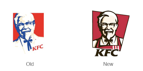
KFC has a nice refresh of their logo – The colonel has taken off his suit coat and put on an apron – like he’s ready to serve you. This version of the logo is much friendlier and inviting. The new angled backdrop to the logo also adds a nice dynamic feel and implies quickness – this isn’t a sit down restaurant! The only thing I don’t enjoy about this redesign is the integration of the type into the symbol. It feels like the type should be more of a separate element rather than attempting to integrate it with the illustration.
Detroit lions
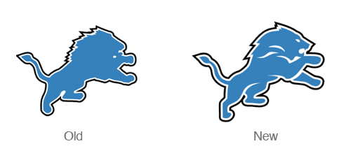
While some may not like the logo – It seems like a step in the right direction. The old lions logo seemed flat and boring. The new re-worked illustration has more definition and defines the arms, legs, mane and face.
Sprint
When Sprint merged with Nextel a few years back they underwent massive re-branding campaign. Nextel’s attention getting black and yellow color scheme was merged with The Sprint name. The new symbol is based on sprints signature ‘pin drop’. The switch to a nice sans serif typeface also does wonders for making the logo look modern. This logo really shines when the symbol is set in motion.
UPS
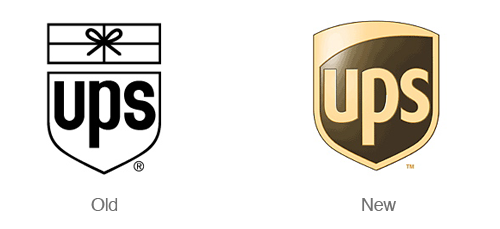
Paul Rand is probably rolling over in his grave over this redesign. UPS decided to re-brand themselves a few years ago (2003 to be exact). The new design feels much more modern and and clean. That being said I could do without the 3d effects. The logo was designed by New York-based FutureBrand.
Chicago Olympic Bid
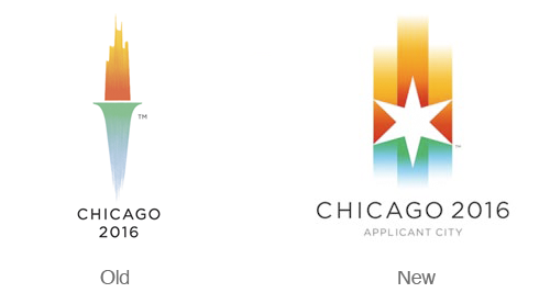
While I was sad to see the brilliant Chicago torch logo go, the new version of the logo is just as brilliant. The new logo features warm gradients that represent the sunset and cool gradients that represent lake michigan. The star is a design element that is borrowed from the city flag and represents a compass pointing in all directions radiating out to the world. Overall I think this is a great redesign full of rich symbolism.
The Bahamas
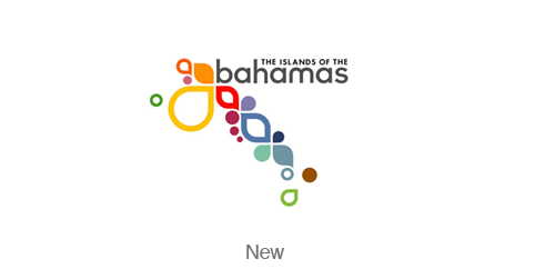
After some extensive research I could not find the original Bahamas logo, but the design itself is amazing enough to mention. This identity is fresh, dynamic, fun and colorful – much like a vacation in the Bahamas. Read more about the logo at the Duffy & Partners blog.
Argentina
I was unable to find the previous branding for Argentina. The new logo is part of an evolving and dynamic design system. The ribbons of the logo communicate passion, expressiveness and change. Designed by Guillermo Brea & Associates
Citi
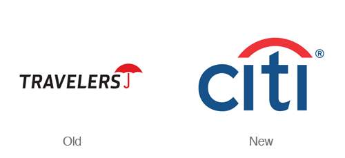
Can you imagine designing a logo in just a few seconds (and 34 years of experience)? Paula Scher did just that in a client meeting with then named Travelers group insurance. The company was re-branding but wanted to maintain their distinctive umbrella symbol. This logo is simple and brilliant in the way it combines a simplified version of an umbrella and simplified type. Designed by Pentagram.
Delta Airlines

More of a realign than a redesign – this new delta logo is sharp! The colors in the new logo are more subdued and the choice of a all caps sans serif typeface makes the logo feel more modern. The new symbol also has a nice dimensional aspect to it without getting into cheesy 3d effects. Designed byLippincott Mercer.
Cisco Systems
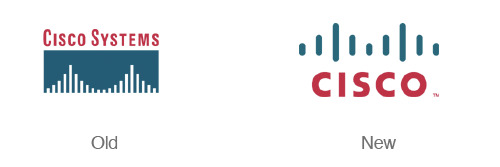
Cisco Systems updated their logo and name back in 2006. With the shortened name and the new simplified ‘bridge’ this logo is much more bold and memorable. Designed by Joe Finocchiaro and Jerry Kuyper.
BP
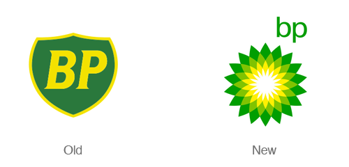
The BP logo redesign takes a boring, static shield with initials and transforms it into a bright, colorful clean flower. This logo is an attempt to move the company in a completely new direction (or just reflect that in the image). Designed by Landor.
Gatorade
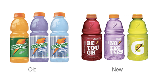
Gatorade is the only part of the Pepsi re-branding scheme that I actually enjoy. I love the new simplified G and lightning bolt. I’m also quite fond of the bulky slab serif font used on their packaging.
Envato
The eden/envato re-brand a logo update is refreshing and simple. I love that they kept some of the elements from the original logo and included them in the leaf. The original logo and named portrayed a sense of springing to life with creativity and this has been carried through to the new design. Designed by Collis Ta’eed.
Best Buy
Best Buy takes a step away from their large, chunky yellow price tag and ultra bold typeface for a more modern, less in your face logo. The new design still features the signature yellow tag – but in a much more subtle way.
Swisscom
The new swisscom logo is dynamic and simple at the same time. The new word mark includes a simple sans serif with curves on the I and the M that reflect the curvature in the mark. This logo really shines when it is set in motion and applied to packaging. Check it out here. Designed by Moving Brands.
NBC
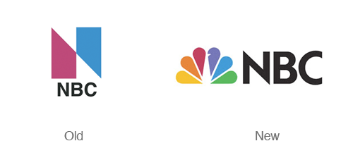
Probably one Americas most well known logos – The NBC peacock logo is iconic. The simplistic and stylized illustration of the peacock with its head reversed out of one of the feathers is brilliant and distinctive.
Burger King
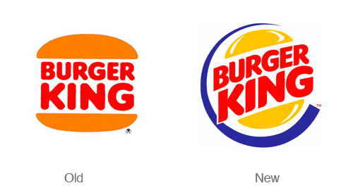
The new Burger king logo takes a dynamic spin on a classic logo. This new design takes some cues from food packaging that features white highlights. The logo retains part of the color scheme and includes a new yellow and blue.
Starbucks
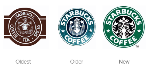
The original Starbucks logo sported a wood cut type illustration of a siren from Greek mythology. Today the current incarnation of the logo is much more streamlined and and memorable.
And now the not so great:
Sierra Mist
The sierra mist design was not great before, but now its just a blurry mess. This is a far to literal interpretation of the brand.
Tropicana
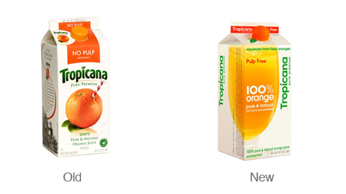
The new Tropicana redesign has been almost universally rejected by designers and the customer base. This redesign was an attempt to make the brand appear simple and down to earth. In the end Tropicana went away from its signature iconic image: the orange with the straw in it – making it difficult for customers to spot the brand at the store.
Wisconsin
The Wisconsin department of tourism decided to undergo a re-branding of their state in order to help attract visitors and display a positive image of the state. First off – the typeface is very strange. I’ve never seen a W or an N quite like that. The text is also warped to show a faux-3d effect. The effect is not taken far enough so it just makes the text look off. The man doing a cartwheel symbol is also cheesy. This logo could have been approached in an entirely different manner and been much more successful. I’m sure there were other more iconic aspects of the state of Wisconsin (cheese???) that could have been incorporated into this logo.
Walmart

Walmart updated their corporate logo last year, transforming its identity from a 70′s looking heavy typeface to a much friendlier sans serif. I’ don’t mind the typeface update, but the orange star burst says nothing. Much like Kraft’s random-swooshy-flower thing – this new symbol for Walmart says nothing. Its too generic and looks like stock art. Walmart was trying to renew their image, but IMO they failed horribly.
Kraft
The Kraft re-branding is wrong in so many ways. It is slightly reminiscent of several non descript-random-swooshy pharmaceutical logos I have seen time and time again. While the original logo may have not been stellar, it was a staple for such a long time that the decision to re-brand seems like it was made on a whim. Perhaps a refresh would have been a better option rather than a complete re-branding. This project was designed by a combined effort of consumers, employees, and Nitro Group.
Mountain Dew
The new ‘MTN DEW’ design is part of the pepsi re-brand. I’m not digging the text-message style rename or the ultra slanted and abstract illustrations on the new can.
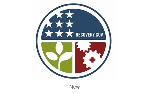
Recovery.gov
This isn’t really a redesign at all, but I think this logo misses the mark a bit. The recovery of our economy is a complex process, but this logo could be simplified and unified. The Recovery.gov type gets lost in the detail of the logo. I think the type should be a separate element from the symbol.
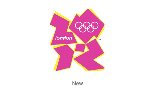
London 2012
I have no doubt that hours of thought and hard work went into the design and research of this logo. The result however looks very amateurish and trendy. The shapes that make up the ’2012′ aspect of the logo are almost illegible. The typeface that ‘london’ is set in reflects the edginess of the logo – but is still difficult to read.
Capitol One

Capitol one joins the army of nondescript swooshes in the vast sea of logos. (Look up any medical related logo and watch the swooshes abound!) I’m not sure what the swoosh means or what it does for the logo. The only thing I like about this logo is the addition of the red – it ads some contrast and character.
Xerox
At first glance this logo looked vaguely familiar – distinctive X and a sphere. Looks sort of like the Xbox logo. I much preferred the older ‘pixilated’ version of the logo. It was so much more distinct.
Quark
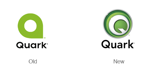
While the last iteration of the Quark logo was less than original (see the scottish arts council logo, or the bahamas logo) – this new logo is just as generic. Faux bevel and emboss with a shiny metallic effect. Next Please.
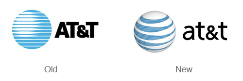
AT&T
I like the updated symbol of the ATT logo, but i don’t understand the lighter blue circles within the globe. Looking at all the circles makes me slightly dizzy. I also preferred the all caps typeface from the pervious version of the logo.
I use Google every day for email, search and calendar. While their services are amazing their logo is not. Although it is extremely distinctive (because of popularity of their services) Google’s logo is horrible! Drop shadows, beveling and emboss make this logo horrifying on the eyes. Maybe this is a case where bad design can be successful?
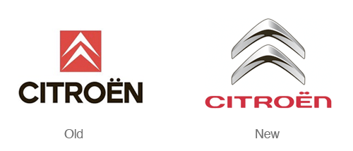
Citroen
The new Citroen logo misses the mark by going the route of an overused metallic 3D graphic effect. The typography looks futuristic and cheesy. I do like the new softer shape of the arrows. Less 3d and a better typeface choice would do this logo good.
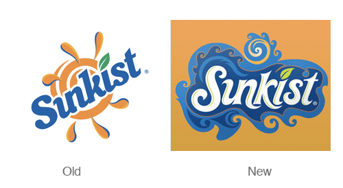
Sunkist
The lettering of this new logo has a nice swirly quality to it. I’m also enjoying the nice u-n ligature. While I enjoy the lettering the amount of swirls are completely overwhelming and cause my eye to move around the design way to much.
Fanta
I think the bold type sans the perspective of the previous logo is a step in the right direction but all the other elements in the design make it far to busy.
Toronto Blue jays
Another great classic sports logo has bit the dust. This new logo design misses the mark – removing the maple leaf and the red makes this logo less distinctive and boring.
Dollar General
The original logo was not very eye catching or distinctive and neither is this iteration. I do however like the updated typeface. The containing shape represents a stretched dollar, but I think this gets lost in the details.
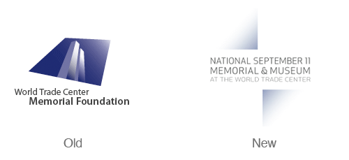

The new world trade center memorial foundation logo bland and not memorable. It almost seems to light for such a serious topic. I much preferred the footprint and building mark combination of the previous logo.












No comments:
Post a Comment
Note: Only a member of this blog may post a comment.